
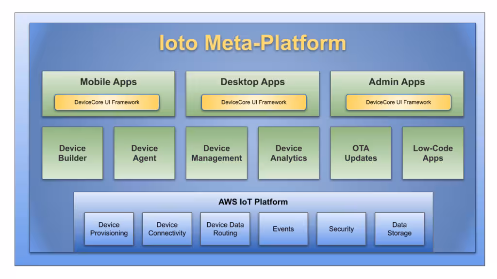
Ioto® Cloud Service
The Ioto cloud service enables you to centrally operate and manage one or millions of devices. The Ioto cloud service stores device data, manages communications with your devices and provides a device management application to manage devices. By aggregating critical device data in one place, you can easily manage your devices and extract important data analytics and intelligence from your devices.
Device Cloud Services
The Ioto device cloud service provides:
- Cloud-based device database store for centralized management and analytics.
- Provisioning Ioto-based devices with certificates for secure communications.
- Secure management of device communications with denial-of-service protection.
- Automatic creation of device metrics based on device data.
- Management of over the air device updates.
- Device apps for managing a single devices or a large fleet of devices.
- Huge scale supporting 10,000,000+ devices per device cloud.
Device Cloud Types
Ioto supports three types of device clouds:
- Eval Cloud
- Cloud hosted by EmbedThis
- Dedicated cloud in your own AWS account
When creating a device cloud, the Builder will create all the necessary resources for IoT management. This process results in a configured, complete, integrated and live IoT cloud capability.
Eval Cloud
The Eval cloud will probably be your first experience with Ioto device clouds. The evaluation cloud is a shared device cloud that is intended for the short term evaluation of a few devices. It enables you to connect a device running the Ioto agent to the cloud and to receive device data and manage the device.
The Eval cloud is free to use for a few devices for a short period of time for evaluation purposes.
Hosted Device Clouds
A hosted device cloud is a device cloud for your devices and customers that is hosted by EmbedThis on secure AWS IoT infrastructure. You do not need to have or manage your own AWS account to use a hosted device cloud.
Device data goes directly from your devices to the device cloud in the region you select when creating the device cloud. Data does not transit other regions or third-party services. This is important as governments and authorities are increasingly requiring that data only be stored, processed and managed locally.
Unlike other IoT services, Ioto provides decreased latency by locating device data in a region close to you. This lowers cost and boosts performance of your cloud-based management solution.
A hosted device cloud provides:
- An AWS DynamoDB database exclusively for your device data.
- AWS DynamoDB streams to replicate device data to and from the cloud.
- An AWS API Gateway to authorize remote API access to device data.
- An AWS Cognito User Pool to authenticate user access.
- An AWS CloudFront and S3 site for device apps.
- AWS Route53 domain for device apps.
- AWS Lambda functions for cloud-side device management.
- AWS IoT Core policies and message routing rules.
- AWS IoT Things to model your devices in the cloud.
Dedicated Device Clouds
A dedicated device cloud is created in your AWS account so you have the ultimate in the control and privacy of your device data. With a dedicated device cloud, device data goes directly from your devices to the device cloud in your AWS account. The device data is not sent through EmbedThis servers. The data is encrypted throughout and you have total control.
Dedicated clouds support an enhanced set of AWS services beyond those available with hosted device clouds. These include:
- Device log file capture and storage in AWS CloudWatch logs
- Audit operations via AWS CloudTrail
- Device AWS keys to initiate AWS API operations from the device
Device Apps
For each device cloud, you can create one or more apps with which to manage your devices.
Device management apps are based upon the DevCore UI Framework which is a flexible UI framework that can be uniquely configured for your devices. It can be completely customized with your logo, product name, device data and device specific screens and custom logic.
Device apps are hosted by EmbedThis on a domain of your choice that reflects your company or product's brand.
Device Certificates
Devices require X.509 certificates to securely connect and communicate with the cloud. The certificates are used to uniquely identify and authenticate devices and then to encrypt communications to prevent tampering or eavesdropping.
Ioto will automatically create and distribute the unique per-device certificates. This eliminates the pain of certificate creation and distribution and effectively isolates the security of each device and prevents the compromise of one device's certificate from impacting other devices.
Device Messaging
During device provisioning, the Ioto service will setup the necessary AWS resources to enable secure efficient messaging via AWS IoT core using the MQTT protocol. MQTT is a messaging protocol for IoT. It is a lightweight publish/subscribe messaging transport that is ideal for connecting remote devices.
Device Data Aggregation
Collecting, aggregating and sending device data to a central management store can be complex and costly. Ioto takes the hassle out of exporting device data to the cloud by synchronizing the Ioto device agent database with an AWS DynamoDB database in your device cloud.
Data written on the device to the management database will be transparently exported to the cloud as required. Similarly, data written to the cloud database will be distributed to the appropriate devices as required. No programming is required.
The database synchronization is full-duplex in that data can be modified in the device or in the cloud and it will be replicated to the other side. The synchronization is controllable on a per-device and per-table basis. Performance can be optimized by buffering and aggregating changes to reduce message overhead.
This replication capability is similar to AWS DynamoDB Global Tables, but instead of acting inside AWS between AWS regions, it is between an AWS region and a device.
This replicated device database is unique to Ioto and dramatically simplifies the creation of IoT solutions.
Device Access Keys
For dedicated device clouds, Ioto can optionally create and manage AWS IAM access keys for your devices. AWS uses IAM access keys to authenticate and authorize actors on AWS resources. The Ioto device cloud can create specific IAM keys to enable devices to directly issue requests to the device cloud and AWS services.
The Ioto generated temporary IAM access keys have tightly controlled access permissions. The keys are automatically reissued as required.
Device Logging
For dedicated device clouds, device logs and files can be captured and sent to AWS CloudWatch logs for storage, governance and analysis.
The Ioto agent can be configured without coding, to capture any O/S log or program output and send it to CloudWatch Logs.
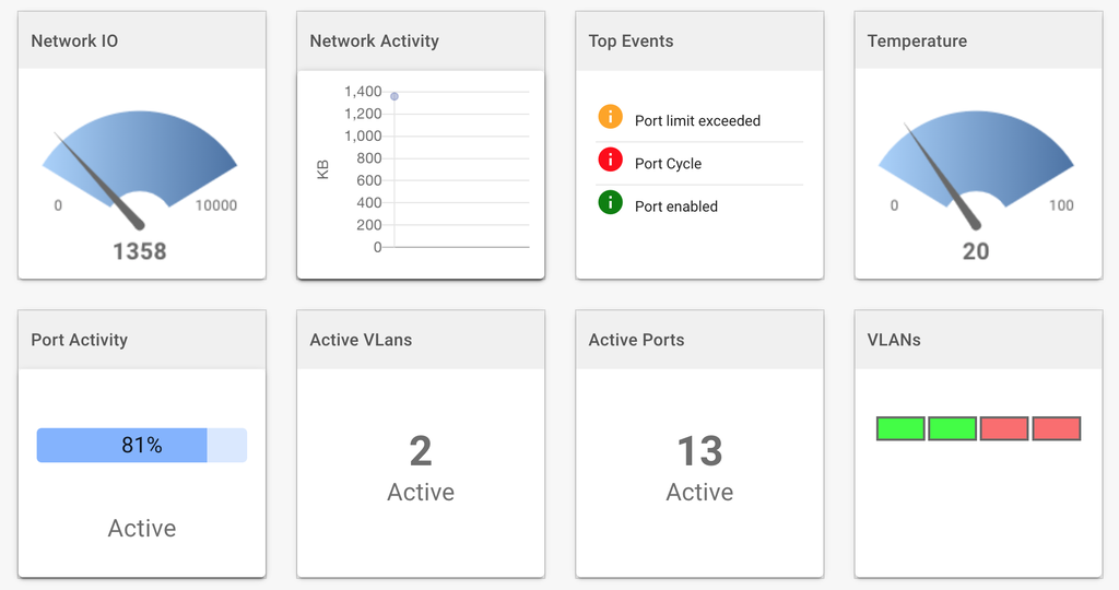
Device Metrics and Analytics
Ioto provides a comprehensive, scalable metric service. Metrics can be transparently created from device data changes. The Ioto metrics are dramatically less expensive and more scalable than AWS CloudWatch metrics.
Using these Ioto metrics, you can create detailed device analytics and dashboards to focus on any aspect of your device or fleet performance.