
Widget Types
The following widget types are supported:
| Widget | Description |
|---|---|
| button | Clickable button |
| event | Table of top alert event |
| form | Input form |
| gauge | Numeric gauge |
| graph | Numeric graph |
| image | Image |
| input | Input field |
| led | RGB Leds |
| numeric | Numeric value |
| progress | Progress widget |
| set | Service Overview |
| shape | Arbitrary shape |
| sign | Signpost |
| table | Tabular data |
| text | Text |
| toolbar | Dashboard Toolbar |
The following Input widget subtypes are supported:
| Widget | Description |
|---|---|
| checkbox | Checkbox |
| combo | Combination Box |
| date | Date |
| file | File |
| password | Password |
| radio | Radio |
| select | Select |
| slider | Slider |
| switch | Switch |
| text | Text Field |
| textarea | Text Area |
Button Widget
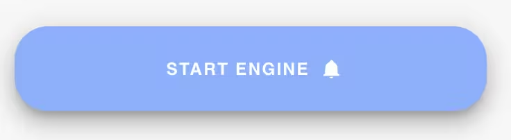
The button widget provides a simple clickable button and is typically used with widget actions to navigate to a new app page or to invoke a cloud-side automated action.
There are two varieties of button:
- Text Button
- Icon Button
Configurable fields
| Field | Description |
|---|---|
| footer | Footer text to place at the bottom of the widget |
| header | Header text to place at the top of the widget |
| text | Button text if using a button icon |
| title | Title text. Not typically used. |
Custom CSS
| Property | Description |
|---|---|
| --w-icon | Icon to use instead of text. E.g. "$edit". |
| --w-elevation | Elevation in pixels of the button. Default is 0. |
| --w-prepend-icon | Icon to prepend before the button text. |
| --w-append-icon | Icon to append after the button text. |
| --w-rounded | Set to round the button corners. Set to 0, XS, SM, LG or XL. |
| --w-variant | Set to elevated, flat, tonal, outlined, text or plain. |
More widget documentation coming soon...