App Designer
The App Designer is a visual, low-code tool for creating and customizing device management application interfaces. It enables you to modify UI controls, data displays, themes, colors, and branding without writing custom code.
The App Designer runs within the device app and is available to users with the owner role.
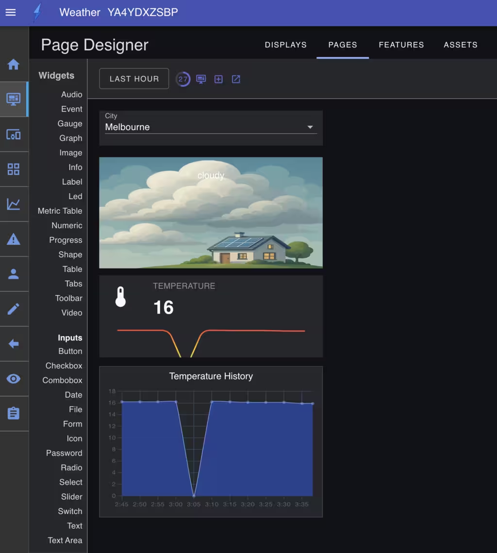
Core Components
The App Designer consists of four main components:
- Display Manager - Configure display settings for different device types
- Page Designer - Create and modify UI pages with drag-and-drop functionality
- Feature Designer - Configure app features and capabilities
- Asset Designer - Manage logos, images, stylesheets, and custom components
Display Manager
The Display Manager supports creating multiple display configurations for various device types including mobile, tablet, and desktop. Typically, you would create a single responsive display that adapts to different device types. However, you can also create specific displays for particular form or usage factors.
Each display definition contains a JavaScript expression evaluated at runtime to determine if the display should be used on the current device. The expression can access device properties such as agent width height language version and timezone.
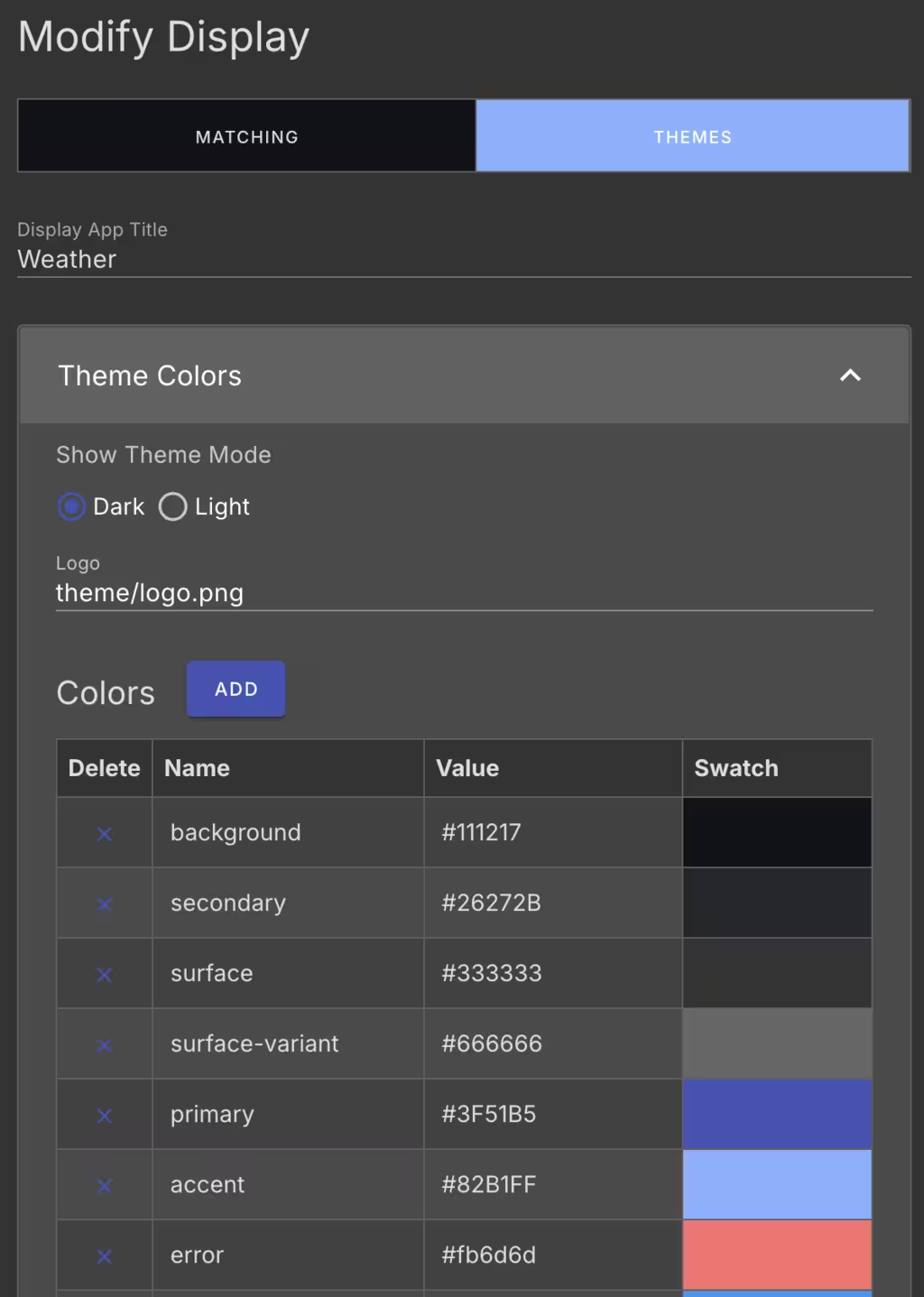
Display Configuration
For each display, you can customize:
- Display Matching - The expression used to determine if the display should be used on the current device.
- Theme Settings - App title, logos, colors, fonts, and data formats
Page Management
The App Designer enables you to create and modify UI pages for each display. The Pages tab shows all pages in the app, displaying the UI path, menu name, icon, and rendering component.
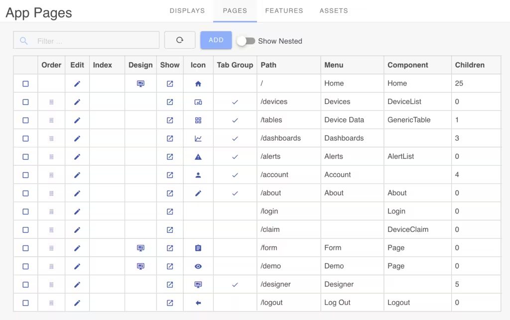
Page Operations
- Add Pages - Click
Addand select thePagecomponent - Reorder Pages - Drag and drop page list items
- Edit Properties - Click the edit icon to modify page settings
- Visual Design - Use the Page Designer for drag-and-drop page creation
Page Configuration
For each page, you can customize it using the Page configuration panel.
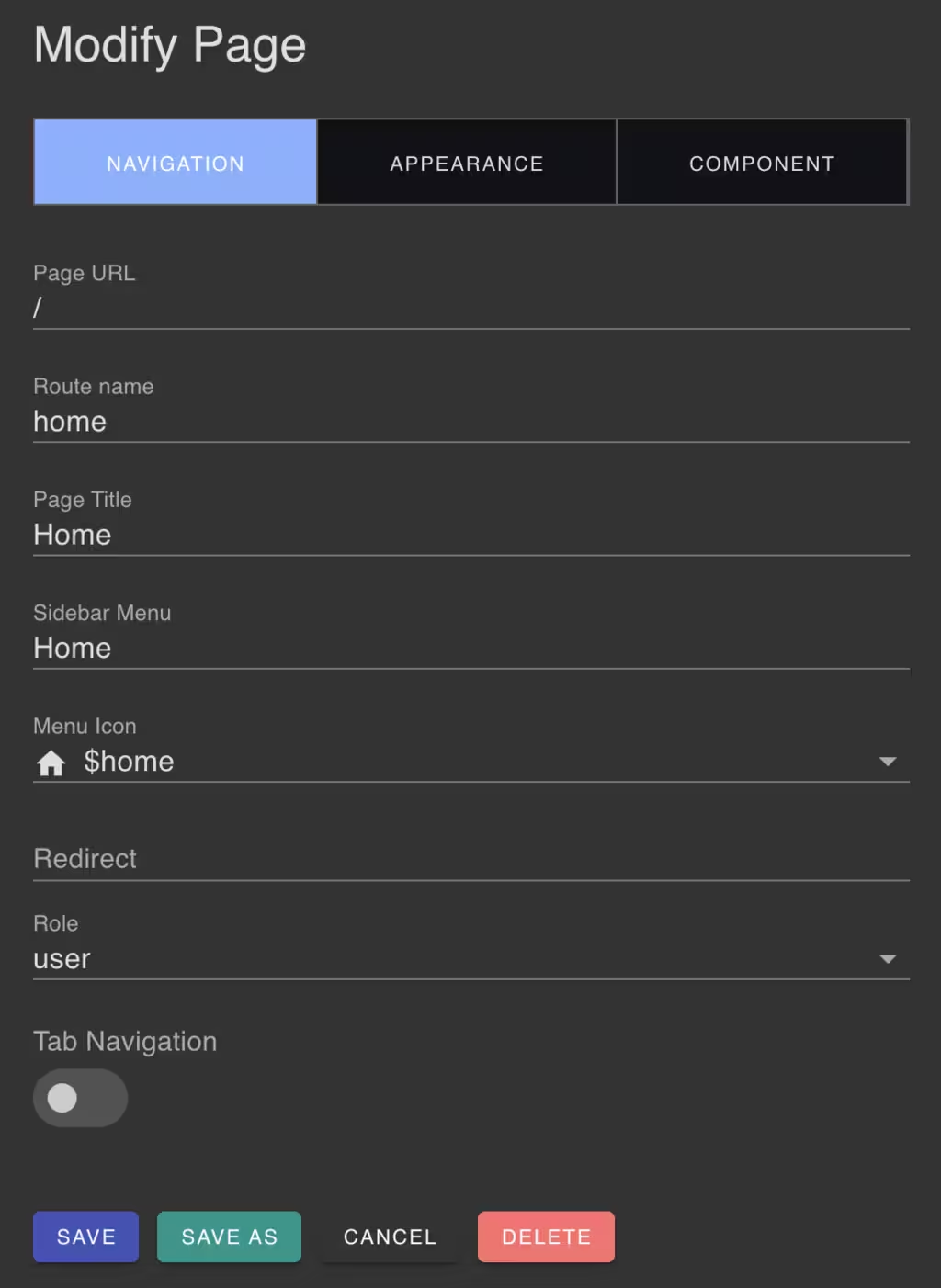
Pages have the following configuration options:
Basic Settings
- UI Path - Required routing path for the page
- Internal Name - Optional identifier for internal use
- Menu Integration - Icon and placement in sidebar menu
Security Settings
- Access Control - Specify the required user roles for who can view and interact with the page. (
owner,admin,user,public,inherited)
Navigation Options
- Tab Navigation - Enable tabbed display for child pages
- Parent-Child Relationships - Organize pages hierarchically
Page Designer
Pages are implemented by composing UI elements as widgets on a background "canvas". Widgets can be added, removed, posiitioned and resized as needed.
The Page Designer provides a drag and drop visual design interface for page layout and content. The Page Designer offers over 30 widgets for building interfaces:
Output Widgets
- Audio, Event, Image, Label, LED, Line, Metric, Progress, Shape, Tabs, Toolbar, Video
Input Widgets
- Button, Form, Input controls, Sliders
Data Widgets
- Info Cards, Guages, Numerics, Tables, Charts

Feature Designer
The Feature Designer configures the app's supported capabilities including authentication, navigation, cloud management, and visualization features.
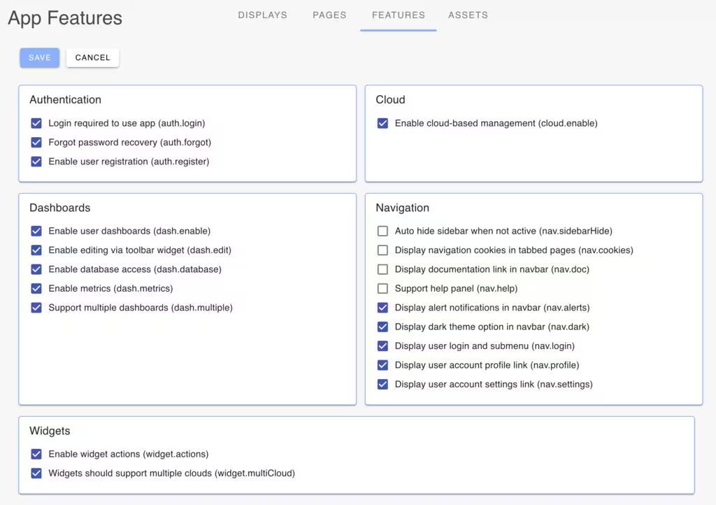
Use the Feature Designer to:
- Enable/Disable Features - Control which capabilities are available
- Configure Authentication - Control user authentication methods
- Manage Navigation - Configure navigation features and presentation
- Dashboards - Configure user dashboards
- Cloud Integration - Configure cloud service connections
Asset Designer
The Asset Designer manages additional app resources including logos, images, favicons, stylesheets, and custom VueJS components.
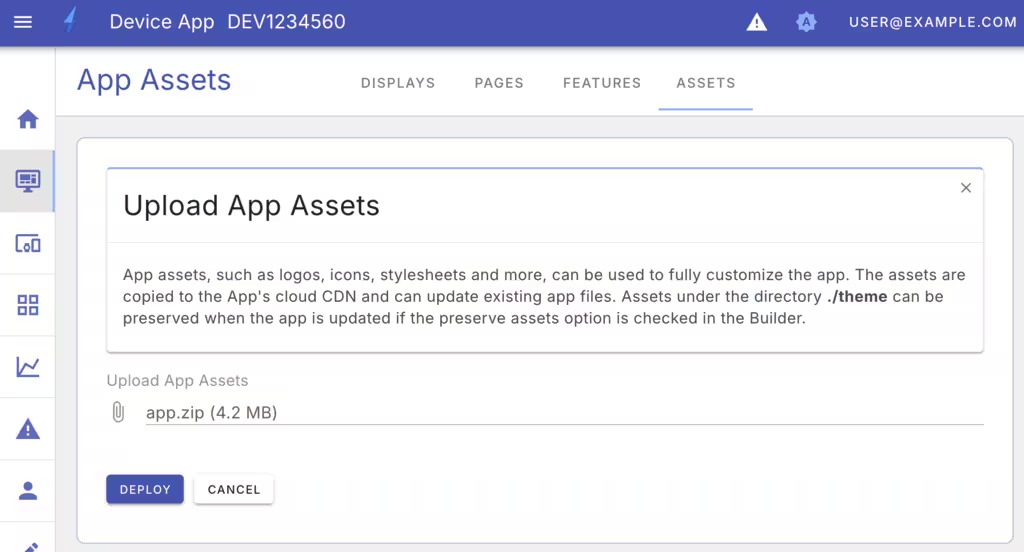
Asset Management
- Upload Assets - Add logos, images, and custom stylesheets
- Custom Components - Upload VueJS components for extended functionality
- Device-specific Assets - Configure different assets for mobile, tablet, and desktop
Asset Visibility
Uploaded assets are available to all app displays, but can be configured for specific device form factors. For example, you can upload different logos for mobile devices or different themes for light and dark modes.
Development Workflow
- Configure Displays - Set up device-specific display configurations
- Create Pages - Build UI pages using the visual designer
- Arrange Widgets - Position and configure widgets on pages
- Configure Features - Enable required app capabilities
- Upload Assets - Add branding and custom resources
- Test Interface - Verify functionality across device types
Access Control
The App Designer requires owner role access for security. This ensures only authorized users can modify the application interface and configuration.
