
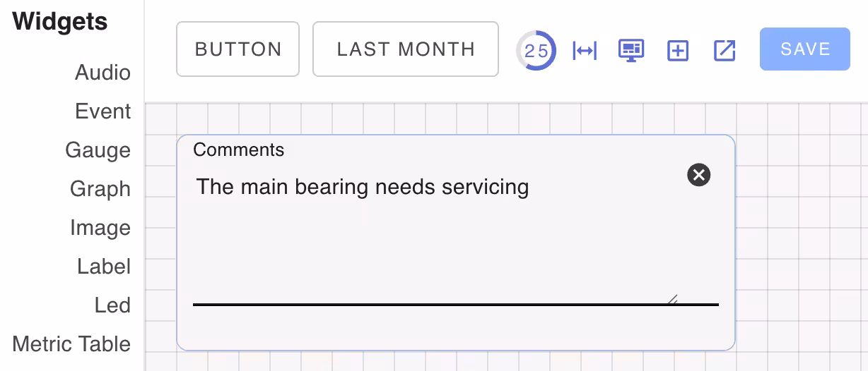
Textarea Widget
The text widget is a simple text input. It may be used stand-alone or as part of a form.
Configurable components
| Class Name | Description |
|---|---|
| card | Background textarea card component |
| primary | Textarea component |
Widget Properties
| Name | Description |
|---|---|
| label | Field label |
| form | Name of the form to submit the text to. |
CSS Properties
These CSS properties configure the underlying Vuetify textarea component.
| Property | Description |
|---|---|
| background | Background color of the textarea |
| color | Text color |