
Input Widget Types
Input widgets are used to gather user input and submit to the cloud via Automated Actions. Input widgets can be used standalone or multiple input widgets can be grouped together with a form widget.
Standalone Input Widgets
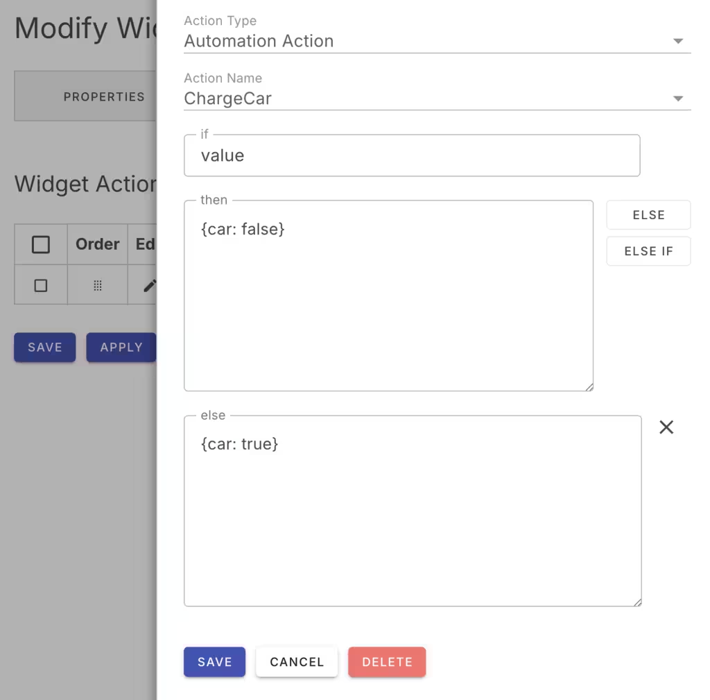
When used standalone, the input widget will submit the input value to the cloud via its configured Widget Actions. Actions invoke the named cloud-side automation with parameters determined by the if statement.
Form Widgets
When used in a form widget, the form widget will gather the relevant input widget values and invoke the form widget action with all the input values. To do this, input widgets designate the form name. Then, when the corresponding form is then submitted, the form widget will gather the input values and submit them to the widget action.

Widget Data
When using individual input widgets, it can be convenient to store data in the Ioto key/value Store table. When using a form widget, it is best to use a dedicated database table that can retrieve a single record that contains all the input values for the form widgets.
Widget Database Actions
If using individual input widgets, the widget action can be configured to store the input value in the Ioto key/value Store table. If using a form widget, the widget action is best configured to store the form input values in a dedicated database table.
Widget Types
The following input widget types are supported:
| Widget | Description |
|---|---|
| button | Clickable button |
| checkbox | Checkbox |
| combobox | Combination Box |
| date | Date |
| file | File |
| form | Input form |
| password | Password |
| radio | Radio |
| select | Select |
| slider | Slider |
| switch | Switch |
| text | Text Field |
| textarea | Text Area |