
Progress Widget
Display a progress bar.
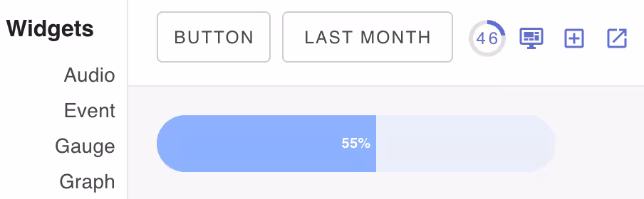
The Progress widget can be used to display the progress of a long running operation.
Configurable components
| Class Name | Description |
|---|---|
| card | Label widget card component |
| primary | Primary label component |
Widget Properties
| Name | Description |
|---|---|
| value | Widget data value that is interpreted as a number between 0 and 100. |
CSS Properties
| Property | Description |
|---|