
Table Widget
The table widget displays a widget data in a tabular format.
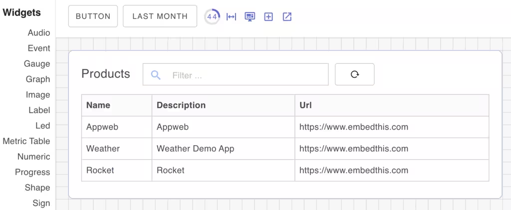
The table widget displays dynamic database or metric data as a table. The table supports filtering, sorting and pagination.
The table has a reload button to refresh the data if it has changed.
Column Configuration
You can configure and format the columns to display the data as you want. The Widget Properties panel has a Columns section that allows you to configure the columns. The columns are defined as a JSON6 array of objects with the following properties:
- name - The name of the column
- width - The width of the column. Enter a percentage of the table width.
- title - The title of the column
- desktop - Display only on desktop displays
- mobile - Display only on mobile displays
For run-time column configuration, you can resize columns by clicking on the column dividor and then dragging to adjust the column size. To reset columns to their original configuration, Control+Click any column and then click the Reset Layout button.
Pagination
The table properties support a pageSize property to set the number of rows to display. The default is 7. If there are more rows than the pageSize, the table will display a pagination control.
Filtering
The table widget supports basic filtering using a caseless full text search. The filter is applied to all columns.
Sorting
The table widget supports sorting on any column. You can click any column to sort on that column. Another click will reverse the sort.
Configurable components
| Class Name | Description |
|---|---|
| card | Label widget card component |
| primary | Primary label component |
| buttons | Table action buttons |
Widget Properties
| Name | Description |
|---|---|
| columns | Ordered array of column definitions |
| pageSize | Initial number of rows to display |
| subtitle | Table title |
| value | Widget data value to suply an array or map of values |
CSS Properties
| Property | Description |
|---|