
Tabs Widget
The Tabs widget displays a series of tab menu items.
The Tabs widget can take one of two formats:
- A map of {name, to} items
- An array of label:URL items
If a map is provided, the tabs will use the map keys as the menu text and the to property as the destination app URL. If an array is provided, the widget will expect label:URL items.
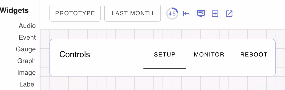
Tabs Title
If the widget header property is set, it will be used as the title of the tabs widget and will be displayed to the left of the tabs..
Configurable components
| Class Name | Description |
|---|---|
| card | Label widget card component |
| primary | Primary label component |
Widget Properties
| Name | Description |
|---|---|
| value | Widget data value to suply an array or map of tab items |
CSS Properties
| Property | Description |
|---|