
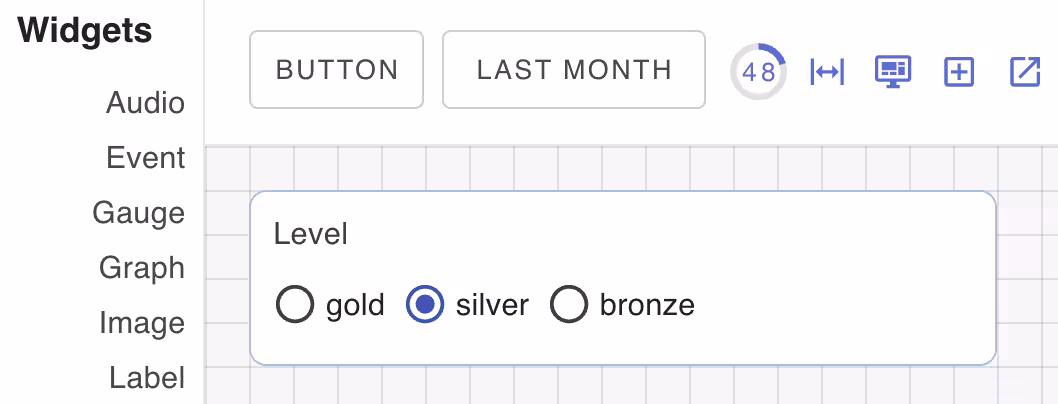
Radio Widget
The radio widget provides a simple radio selection. It may be used stand-alone or as part of a form.
Configurable components
| Name | Description |
|---|---|
| card | Background button card component |
| primary | Button component |
Widget Properties
| Class Name | Description |
|---|---|
| form | Name of the form to submit to. |
| label | Radio label text |
| value | The initial radio value |
CSS Properties
These CSS properties configure the underlying radio component.
| Element | CSS Property | Description |
|---|---|---|
| background | Background color of the button | |
| color | Text color of the button | |
| --v-density | Set to compact, default or comfortable. | |
| --v-ripple | Set to enable the ripple effect. | |
| card | background | Background color of the card |