
Gauge Widget
The gauge widget provides a gauge display for a numeric value.
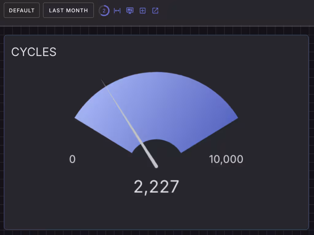
The gauge displays a sweeping needle and background area with minimum and maximum values. A numeric reading is also displayed.
The gauge widget animates the movement no the needle in response to large updates.
Configurable components
| Name | Description |
|---|---|
| card | Background button card component |
| primary | Button component |
Widget Properties
| Class Name | Description |
|---|---|
| format | Format the value using a format string. Defaults to "{value}". |
| min | Minimum value of the gauge. Defaults to 0. |
| max | Maximum value of the gauge. Defaults to 100. |
| value | Value to display on the gauge. Defaults to 0. |
CSS Properties
These CSS properties configure the underlying button component.
| Property | Description |
|---|---|
| background | Background color of the button |
| color | Text color of the button |
| --w-fill-color | The fill color of the gauge arc (defaults to --v-theme-primary with opacity). |
| --w-text-color | The color for text elements like value and labels (defaults to --v-theme-text). |
| --w-needle-color | The color of the gauge's needle (defaults to --v-theme-text-darken-1). |
| --w-units | Optional units to display next to the value. |