
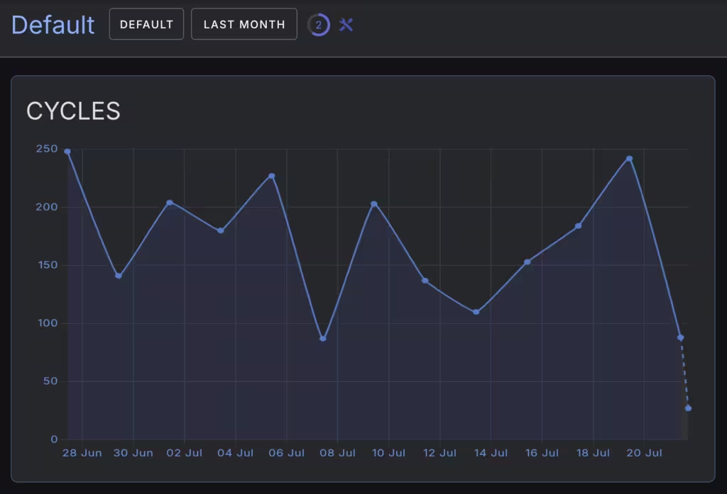
Graph Widget
The graph widget provides graphical line chart display for historical and current widget data.
Configurable components
| Name | Description |
|---|---|
| card | Background button card component |
| primary | Button component |
Widget Properties
| Class Name | Description |
|---|---|
| presentation | Presentation mode for the graph. Defaults to "line". |
| value | Value to display on the graph. Defaults to 0. |
CSS Properties
These CSS properties configure the underlying button component.
| Property | Description |
|---|---|
| background | Background color of the graph |
| color | Text color of the graph |
| font-family | Font family of the graph labels. Defaults to Inter. |
| font-size | Font size of the graph labels. Defaults to 12px. |
| --w-fill-color | Color of the graph fill. Defaults to --v-theme-primary with 0.15 opacity. |
| --w-grid-color | Color of the graph grid. Defaults to --v-theme-accent with 0.25 opacity. |
| --w-last-fill-color | Color of the last graph point fill. Defaults to --v-theme-secondary-lighten-2 with 0.35 opacity. |
| --w-line-color | Color of the graph lines. Defaults to --v-theme-accent-darken-1. |
| --w-line-curve-tension | Tension of the graph lines. Defaults to 0.1. |
| --w-line-width | Width of the graph lines. Defaults to 2px. |
| --w-predict | Extrapolate the last point of the graph if incomplete period. Defaults to false. |
| --w-point-radius | Radius of the graph points. Defaults to 3px. |
| --w-span-gaps | Whether to span gaps between points. Defaults to true. |
| --w-tick-color | Color of the graph ticks. Defaults to --v-theme-accent-darken-1. |
| --w-tick-size | Size of the graph ticks. Defaults to 14px. |