
Widget Presentation
Widgets can be styled by anchoring their position, defining their stacking order and via CSS properties.
Anchoring Widget Position
If you are using the Exact layout engine for your board, you can anchor widgets to various positions of the board. This is useful for example if you wish to anchor a widget to the bottom center of the board.
You can select a vertical and and a horizon anchor position with an offset. The offset can be expressed as a number of pixels or as a percentage of the board's height/width.
If you are using the Grid layout engine, widgets will be always compacted on the grid and anchoring widgets is not compatibile with the grid placement strategy.
Z Stacking Order
With the Exact layout engine, widgets are permitted to overlap. You can define their stacking order by setting a positive z-index value for each widget. The default value is zero. You can also set the z-index by Cmd-Clicking on a widget to bring it to the foregound. This will set its z-index to the highest of all widgets.
Show Expression
You can define an expression to determine if the widget should be displayed. The show expression is a JavaScript like expression that is evaluated to yield a true or false result.
The show expression is provided with a context of variables that can be accessed by the expression. The widget data value is provided in the "value" named variables. You can test this result using a Javscript like expression. For example:
value > 0
See Expressions for more information on the expression syntax.
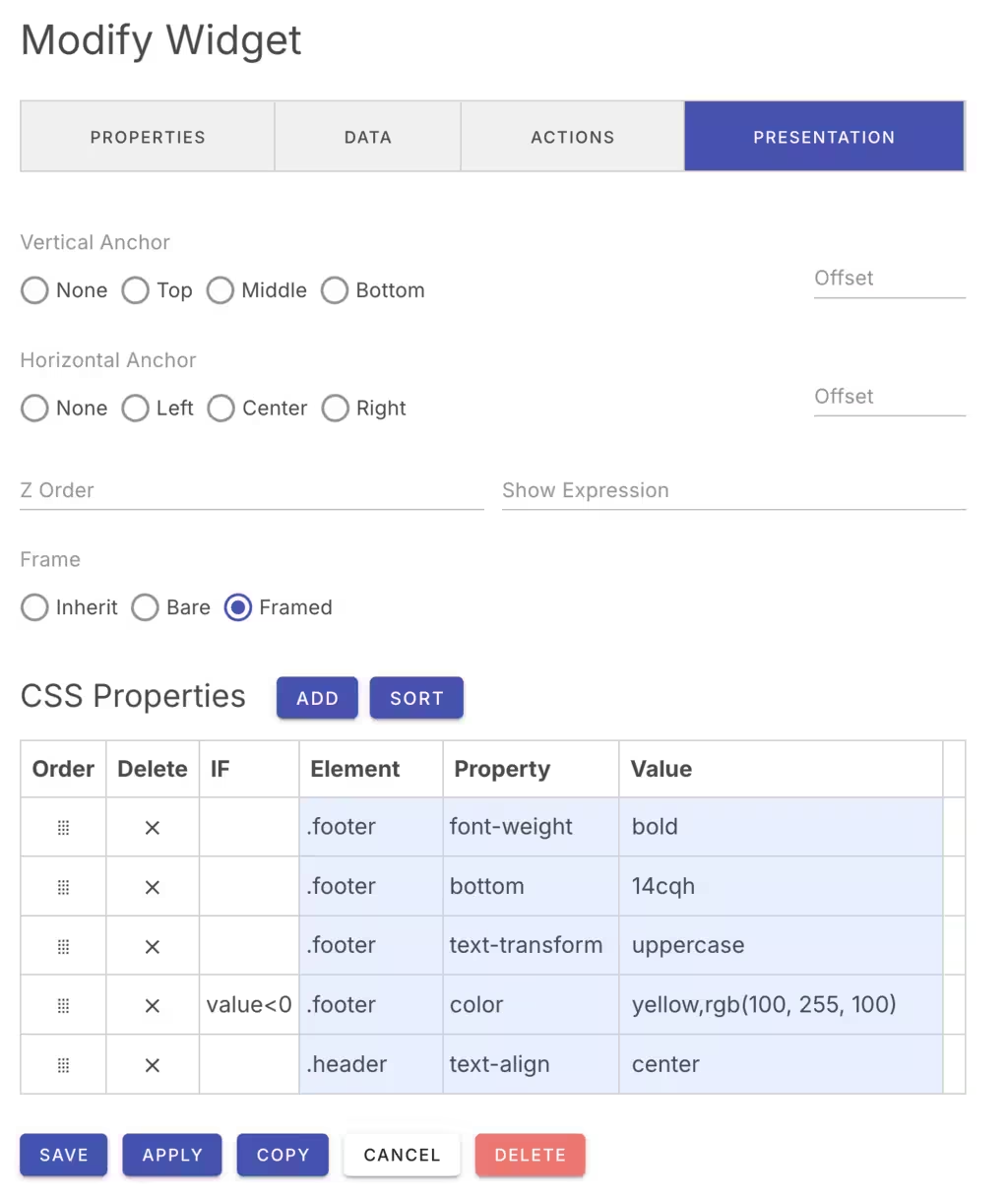
CSS Properties
Widgets will initially display with a default theme based on the current light or dark mode. However, you can override any CSS property for the widget to customize the widget size, colors and style. The WidgetEdit Presentation panel provides a CSS editor to help you define the CSS properties for the widget.
By default, the Widget will inherit any default widget CSS properties defined in the board configuration or by the defined application theme.
The CSS Property name can be any standard CSS property name. For example:
| Name | Value |
|---|---|
| background | red |
If the property name is *class, the class name value will be added if the widget value is not zero (false). Otherwise the class name will be removed. For example:
| Name | value |
|---|---|
| class | "my-class" |
CSS Syntax
CSS names and values can be conditionally applied to specific elements based on runtime data.
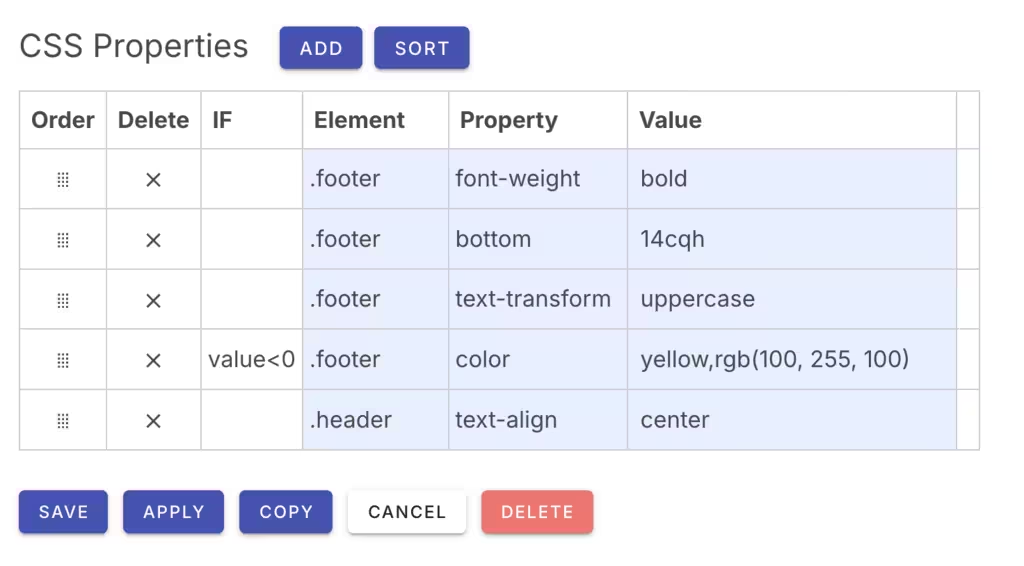
IF Expression
The IF clause is an optional expression that evaluates to determine if the CSS property is applied or not. It can use the widget's value in the expression.
For example:
| IF | Element | Property | Value |
|---|---|---|---|
| value == 'some-value' && width <= 640 | .footer | background | red |
See Expressions for more information on the expression syntax.
Element Paths
A CSS property can be applied to a specific widget DOM element that is described by the component path. A component path can select elements by specifying a path that includes CSS class names, element names and element IDs.
For example:
.area.footer
.header#title
.header,p
You can specify a path from the root of the widget to the element you want to style.
Standard paths include:
| Path | Description |
|---|---|
| .header | The widget header. |
| .footer | The widget footer. |
| .prefix | The prefix text before the widget value. |
| .suffix | The suffix text after the widget value. |
| .card | The widget card enclosing the widget content. |
For example, to set the widget background to transparent, use:
.card | background | transparent
CSS Property Names
CSS property names can be any relevant standard CSS property name, the special class property, a custom Vuetify or DevCore CSS properties.
If the class property is used, the given value will be added to the element as a CSS class name. For example:
class | my-class
This will add the my-class class to the element.
Most DevCore widgets use an underlying Vuetify component to render their content. To pass properties to the underlying Vuetify component, use a --w- component prefix on the CSS property name. This will strip the --v- prefix and provide the property to the Vuetify component. For example:
The Image widget uses the Vuetify v-img component to render the image. To pass a gradient to the Image widget, you can use the --w-gradient CSS property which will define the gradient property on the Vuetify v-img element.
--w-gradient | linear-gradient(to right, red, green)You can also pass parameters to custom DevCore widgets by prefixing the property name with --w-. For example, to set the graph area color for the graph widget, use:
--w-fill-color | red
The --w- properties are interpreted internally by the relevant widget. Each widget type documents the subcomponents utilized by that widget type.
CSS Values
The CSS value can be a single value or a colon separated list of values if an expression is supplied. In this case, the property value can supply two values separated by a colon. If the expression is true, the value before the colon is used, otherwise the one after the colon. For example:
| Expression | Components | Property | Value |
|---|---|---|---|
| value == true | .status | background | red:green |
If the expression evaluates to true, the element with a .status class will have its background will be set to red. If the expression evaluates to false, the background will be set to green.
Notes
CSS values do not need to include a trailing semicolon.